.png)
-p-1080.jpg)

In this tutorial, we are going to show you how to build a data dashboard that can assist with data investigations. This example is based loosely on a workshop with investigators on Swazi Secrets, which had a trove of 89 000 documents to analyse, which included a large number of bank statements to pore over.
What is an investigative dashboard?
Often when we are discussing data with journalists, either teaching or assisting with research, the emphasis is on the storytelling aspects of the work. Quite rightly, there is an emphasis on clearly communicating with readers through the selection and use of charts and not overwhelm them with numbers or complex visualisations that do not add to the narrative.
Analysing data to find context for stories or evidence to support an investigative hypothesis is, to an extent, harder to teach. Journalists are not data analysts, and it takes years to develop the skills to clean, rank and apply formulae to data to verify patterns and find connections in a large dataset. Professional data analysts clearly distinguish between the use of charts for data analysis and exploration, and the use of charts for communication. The former, also known as exploratory data analysis (EDA) can be conducted using the graphing settings in your spreadsheet application or a dashboard-type interface (such as the one OpenUp created for My Vote Counts). A chart used in a news story, on the other hand, should be clear and well-designed, and there is specific software such as Flourish or Datawrapper to do this.
Still confused about the difference? Storytelling requires clear selection of a small set of numbers which create a picture “worth a thousand words”, not one that requires a thousand words to explain what you are looking at.
For the purposes of this tutorial, we are going to use Google Sheets, because it is free, popular and relatively easy to use. You should note, however, that these are both online services that require uploading your data to Google. For sensitive materials, we recommend using offline tools such as OpenOffice Calc and Grafana.
Cleaning the data
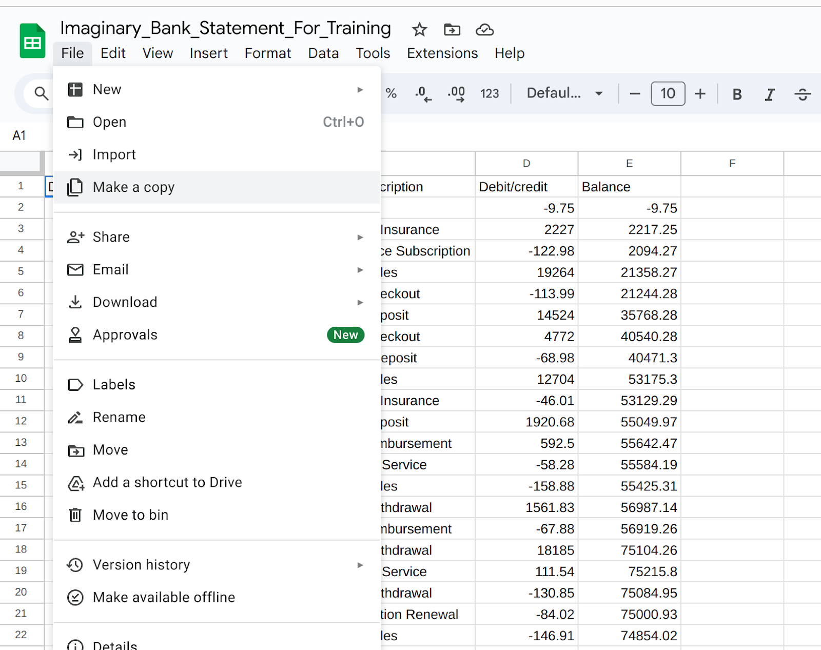
In our example data, here, we have two bank statements which would normally have been scraped from PDFs into spreadsheets, but are filled with dummy data created by ChatGPT. You can find the two bank statements in this Google Sheet. In order to work on it on your own machine, you can either download the file as an Excel sheet or Create a Copy in your own Google Drive. Both of these options are available under the File menu.
Each tab at the bottom of the screen contains data from a different bank account and you can see that the data is already fairly “clean”. Each set of statements is populated with rows that contain a transaction date and description, a credit amount, a debit amount and balance.
Because we want to compare data between the two accounts, the first thing we are going to do is to standardise the tabular format of the sheets. On closer inspection, while the data is clean there are significant differences between Statement 1 and Statement 2.
//Note - display these side by side
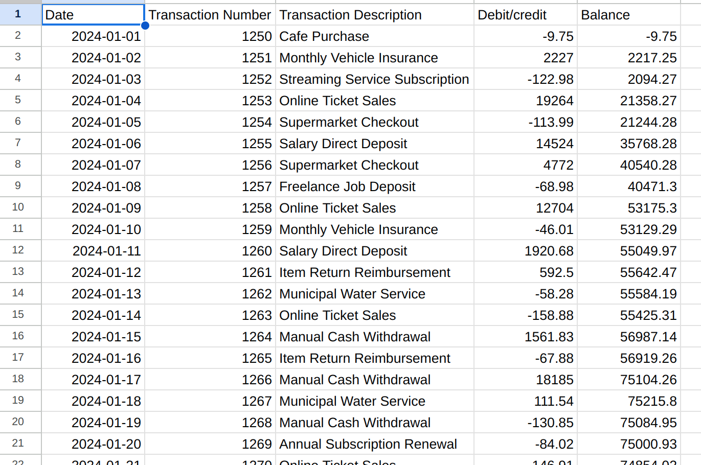
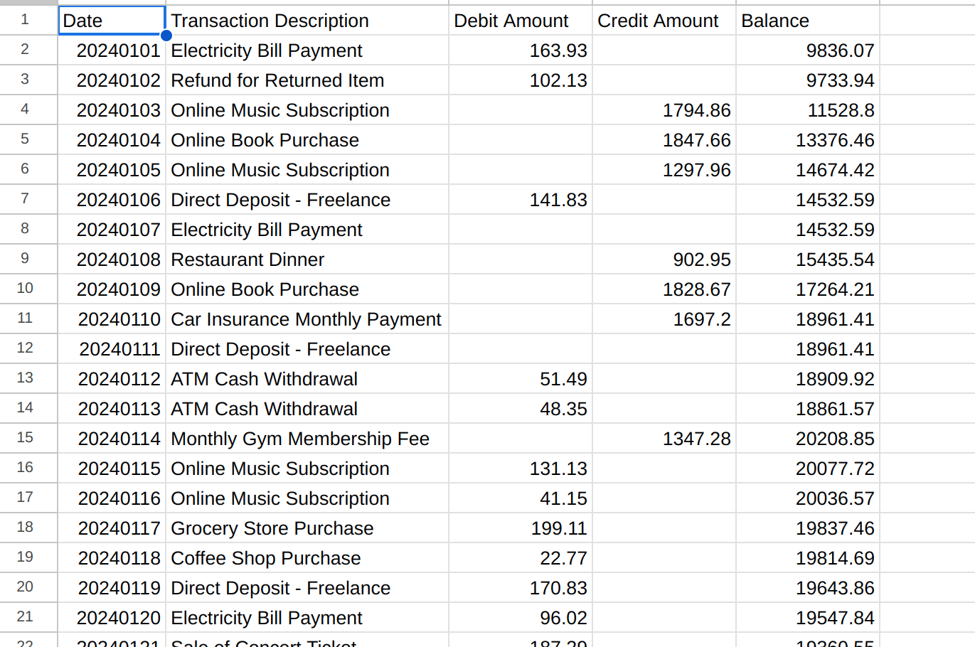
- In Statement 1, the date format is year-month-day, in Statement 2 it is yearmonthday
- There is a transaction number in Statement 1 but not in Statement 2
- In Statement 1, there is a single column for transaction amount and debits are shown as negative numbers. In Statement 2, credits and debits are both shown as positive numbers but are in separate columns.
Fixing the data format
Our aim, then, is to get both spreadsheets into the same format, with seven columns in each:
- Account name We’re adding this column to both sheets so we can identify where transactions come from when they are combined.
- Date In the format yyyy-mm-dd.
- Transaction number This will be an empty column in Statement 2, but we are adding it so that the two tables can be combined without data loss in Statement 1.
- Transaction description As it is written on the bank statement.
- Debit amount As a positive number.
- Credit amount As a positive number.
- Balance From the original statements, but double-checked.
Date
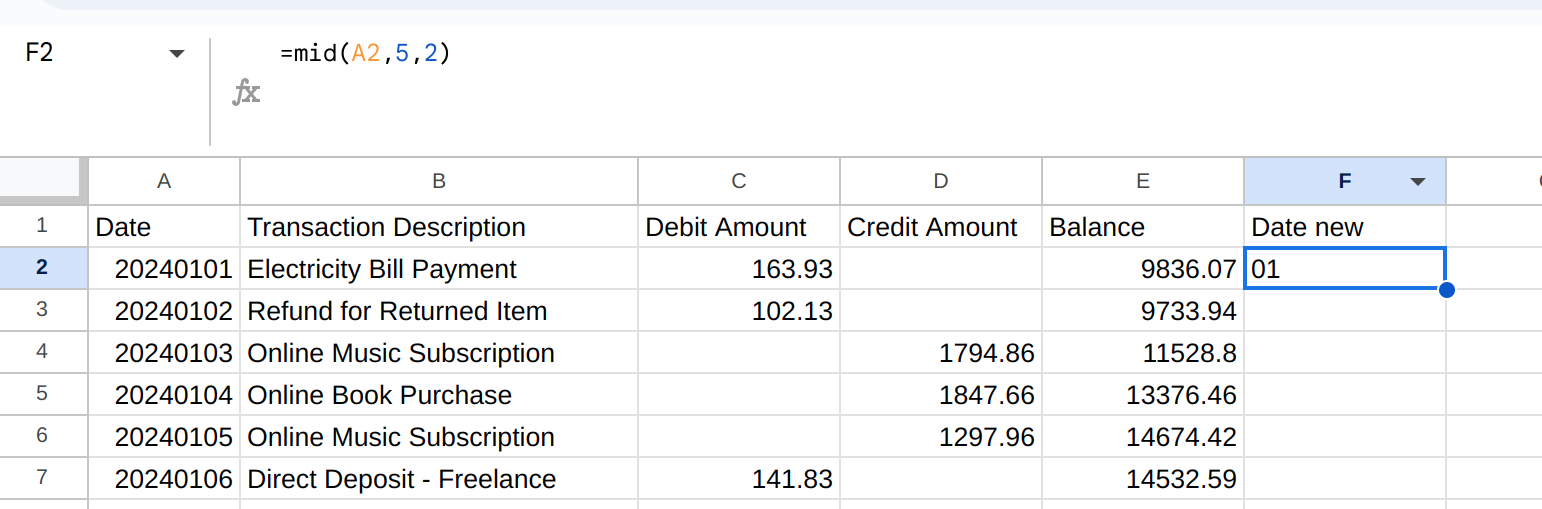
To fix the date in Account 2, we need to add a new column at the end of the table. In this column, we are going to use a slightly complicated set of formulae to extract the date elements and rearrange them. =MID, =LEFT and =RIGHT select characters from either edge of a cell (or from a specific character in the middle). For example, =MID(B2, 3, 2) will look at cell A2 and return characters in the fifth and sixth positions (ie. start at character five and take two characters), which is the month. In the image below, you can see this is 01, or January.
Now, we are going to string these formulae together using the =CONCATENATE formula. Concatenate simply combines multiple elements which are separated by commas into a single piece of text. The formula we will use is: =CONCATENATE(RIGHT(A2, 2), “/”, MID(A2,5,2), ”/”, LEFT(A2,4)). This transforms 240101 into 01/01/2024.

Now we can copy this formula down the whole column. Then click into the column header (F) to select the whole column and press CTRL+C to copy the data. Now click into the column header for column A and use CTRL+SHIFt+V. This command is “Paste as values”, and will overwrite the current column A with the values from column F - not the formula each cell in F contains. Finally, select column A again, and ensure that it is formatted as a date column using Format>Numbers>Date.
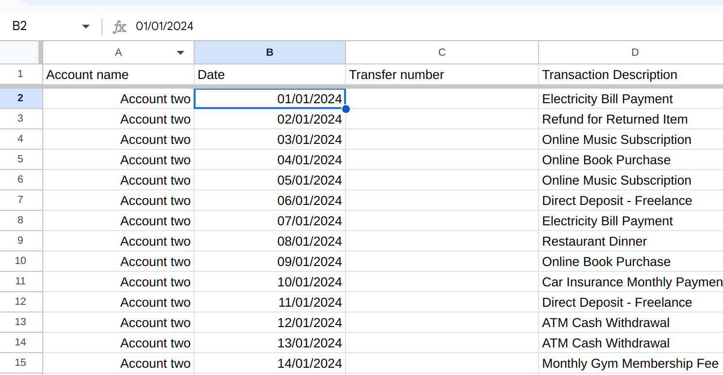
In the screenshot above, we have also added a column at the start of the Sheet for account name, and the blank column for transaction number to match the layout of Account One.
Splitting credits and debits
We also need to split the column for transaction amounts for Account One. This can be done by selecting Column D (Debit/Credit), right-clicking and Add one column to the right. Change the column headings to Debit and Credit.
Now select column D and use the Filter control (the upside-down triangle icon) to create a filter.

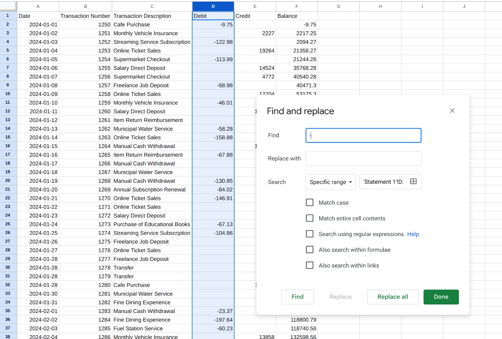
We want to isolate the Credit transactions so we can move them to column E, so using the filter dialogue we are going to create a conditional filter to only see transactions that don’t have a negative indicator in front of the amount. Once the table is filtered, use CTRL+C to copy the numbers from column D and then CTRL+V to paste them into column E. No select the numbers in column D again, and delete them. Turn off the filter and you should see that your table has separated out debits and credits (remember to CTRL+Z and try again if it isn’t working.

Lastly, we need to remove the minus (-) sign from numbers in column D. You do this by selecting the whole column again, then using Find & Replace to look for minus signs and replace them with nothing.
Add a new column to the start of the sheet (left of A) and populate it with the account name, and we can proceed to analysis.

Adding one more thing
Now we have two tables that have matching formats, with column headings Account name, Date, Transaction number, Transaction description, Debit amount, Credit amount and Balance.
These sheets can now be used to produce insights about what is happening in both accounts. For each one, for example, we can produce a Pivot Table to summarise transactions by date, description or transaction amounts. In the sheet for Account One, for example, we can use CTRL+A to select all, and then use the menu option Insert>Pivot table.
If you haven’t used Pivot Tables before, they are a powerful tool for summarising data. You can learn more about the basics here.
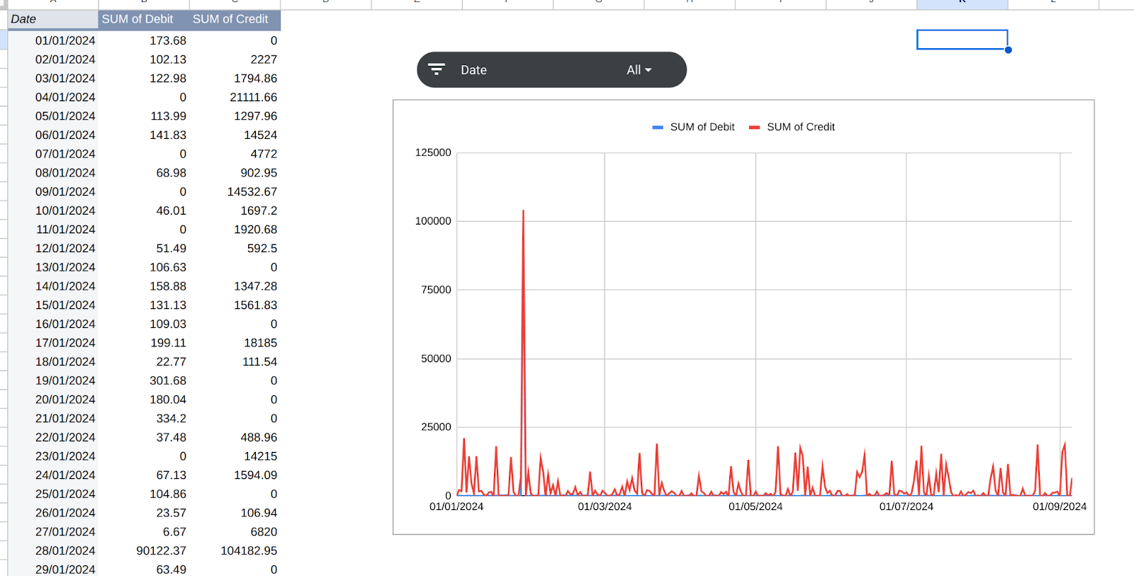
For our first pivot table, we want to see money movements by date, aggregating all transactions in one day together. This will give us an idea of time periods where unusual amounts of money went in or out of an account, even if it was in multiple small transactions. To do this, we will select Date as the row value, then Credit and Debit as values.
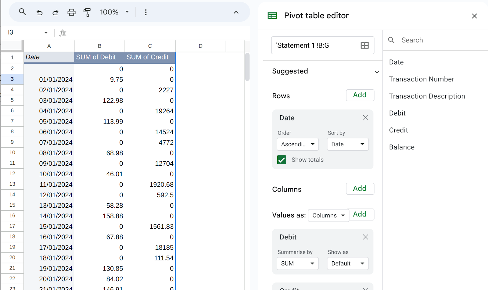
You can see days in which the most money came into an account, by opting to Sort by Credit/Descending (ie. highest values first).
Alternatively, we can Insert>Chart to visualise this data for the purposes of analysis. First of all, sort the Pivot Table by Date/Ascending, then insert the chart. In the chart options, choose Line Chart, then set Date values as the X-axis and your credit and debit columns as Series. You should see a timeline graph with two lines on it.

Building the dashboard in Sheets
While some insights can be gathered by looking at each account in this manner, if we are analysing a lot of accounts with many transactions, we are likely going to be looking for matching transactions moving between them: in other words, on which day did x amount leave Account One and arrive in Account Two.
To speed this analysis up, we can create a new Sheet in our spreadsheet using the plus symbol in the bottom left-hand corner. Let’s call this sheet “Combined”. Using copy and paste, we are going to add all the data from both bank accounts into a single table - just make sure you only copy over the column headings once (ie. grab all the data from Row 2 in one of the sheets).
Now, we want to create another Pivot Table based on this data. For now, using the same Date/Credit/Debit options as last time, and build a chart.
Our chart is quite small, however, and the chances are high that we will want to analyse small chunks of it at a time - for example, it’s likely that an amount may have left an account on one day, but only appeared in another account a few days later. We can give our nascent dashboard a zoom-like function by adding a special filter called a Slicer (Data>Add a Slicer).
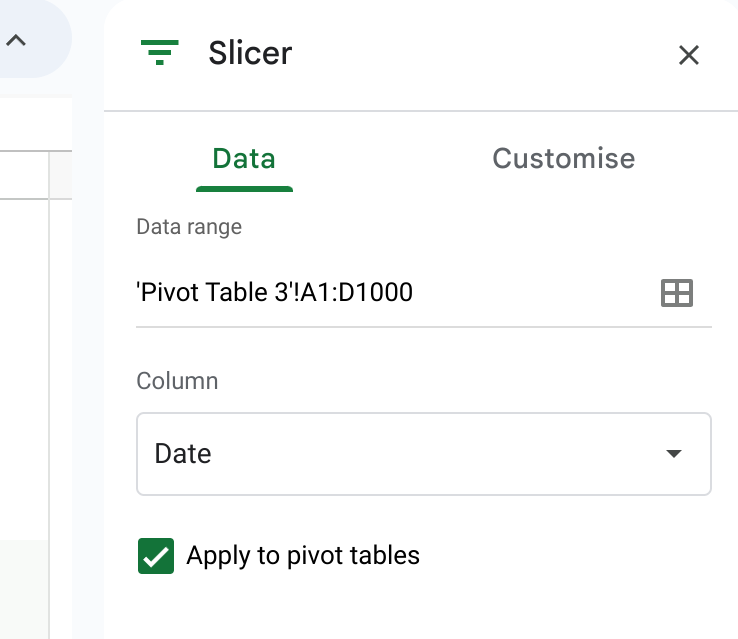
This allows us to filter the data quickly using a new toolbar that we can place anywhere in our new dashboard Sheet. In the Slicer set-up (use the three dot menu) we are going to opt to filter the chart by date.
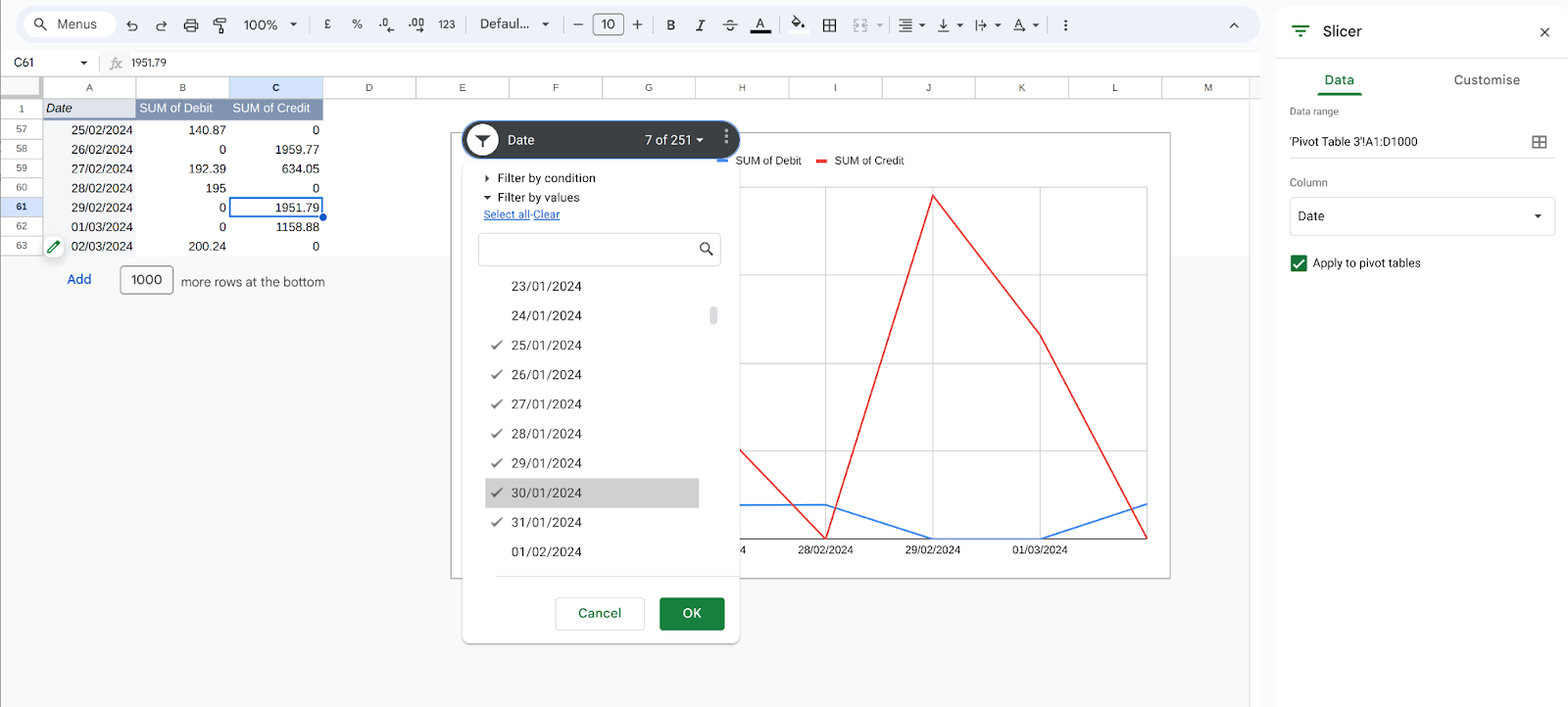
What insights can we draw from our test data? In this case, we can clearly see a large number of transactions happening on a single day, so we can zoom in on the week around that day using the Slicer.
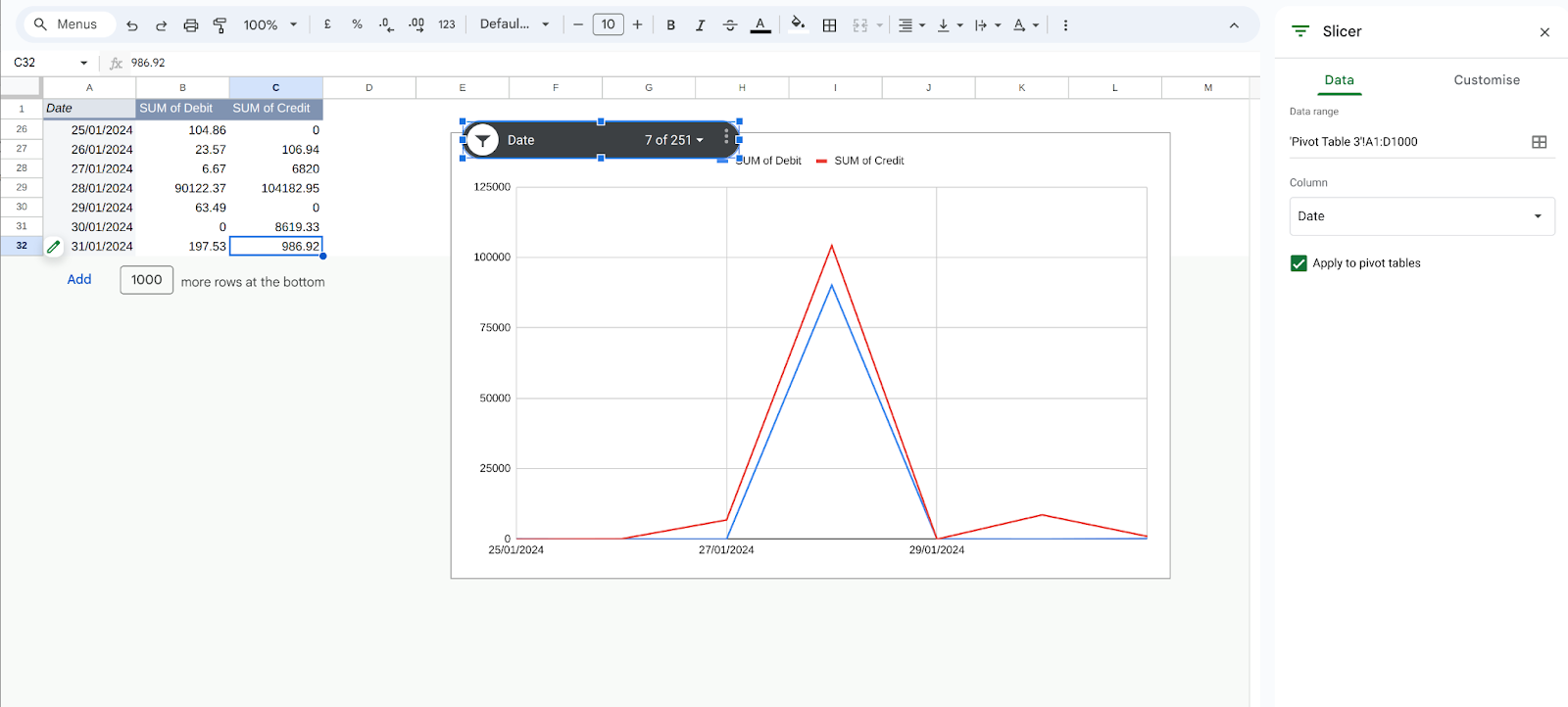
Now, just clicking into the figures in the pivot table will create a new Sheet with a small number of transactions for us to investigate.
These were easy to find in our small data sample, but hopefully, you can see how these techniques will be very useful for more complex, larger investigations. In our next tutorial, we will take it even further and how to use the same data in another tool for even more detailed analysis and insights.Data>Add a Slicer